Viewing options
Interactive projections map
By 2070 temps are predicted to rise even higher than previously estimated.
Summary
Famous for its large natural harbour and its status as a global city, the Metropolitan Sydney Region encompasses the Cumberland Plainand extends west to the Blue Mountains in the Great Dividing Range. The Metropolitan Sydney Region extends from Broken Bay in the north to Garie Beachin the Royal National Park in the south. With over 4 million people, the Metropolitan Sydney Region is the most populous region in New South Wales.
How to use the climate projections map
Select the region, climate variables and timescale that you want to explore from the left Viewing menu.
Detailed Frequently Asked Questions are also available for your assistance.
The map can be viewed in a Region view or Grid view:
- In Region view you can select a region and see more information on the average value of the region for all climate variables.
- In Grid view you can see values for each 4km grid for all variables. Select a grid square to view the value of the variables for that location.
The projections data underpinning this map were developed by the NSW and Australian regional climate modelling (NARCliM) project.
Change in average temperature (°C)
Download projection maps for this region
Below you can download the snapshot and GIS-compatible data for the selected region. These projections information files are based on the NARCliM projections released in 2024.
2020-2039
Change in average temperature (ºC)
Change in average temperature (°C)
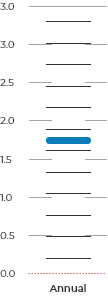
How to read this chart
The bar chart displays the outputs of each of the 10 NARCliM models averaged for the viewing options you have chosen.
The vertical length of the WHITE BAR shows the spread of values from the 10 models.
Each horizontal THIN BLACK LINE is the average for one single model for the region. There are 10 for each bar and do not represent a single location in the region.
The THICK BLUE LINE is the average of all 10 models.
The DOTTED RED LINE represents zero change in the variable.